
Constructed Landscapes
My relationship with nature is not as close as i'd like it to be, I sometimes go to greenwich park, to see the wildlife and flowers bloom especially during the summer season when the weather is the best and nature has life in it. Photographers take pictures of nature because it is peaceful to look at, nature pictures clear your mind they give off a tranquil silence, which is what makes them such good images.


The word landscape you think of tranquility calm relaxing nature, lively cities views from tall mountains. Nature, scenery, buildings, outdoors, environment, architecture, waterfall, cityscape, forest, canyon, new york city.
When I google landscape pictures of new york, the peacefulness of nature appear, vibrant cities, tall mountains. My ideal landscape is at sunset a giant mountain, and maybe even a lake, it would just be a peaceful landscape.
From my bedroom window I see trees of the park a big field, from my classroom I see construction new era, I see two of the opposite views from my bedroom and from my classroom.
My landscapes


I have taken many of these landscapes overtime, but you may notice I have taken them in to areas, some looking over the London skyline and others I took on my Spanish trip, my favourite images are the ones overlooking Canary Wharf at sunset, because of the colour of the sky, it adds much more depth to the photograph, in my landscapes you can spot a common theme of photos taken at twilight, i do this because of the lights from the city it makes the photograph so much more interesting to look at rather than taken in the day.

For this one I took it in prim rose Hill, which is one of the best spots to take photographs of the London skyline, the best part of this image for me is the lamppost lights, I think this adds some real detail and personality to this image, and the thing I love most about this image is how symmetrical it is, the London skyline looks perfect and lights add even more depth. To improve this image I think I could maybe take the picture in a better camera quality and maybe take the image at a better time maybe on a clear night or sunset.
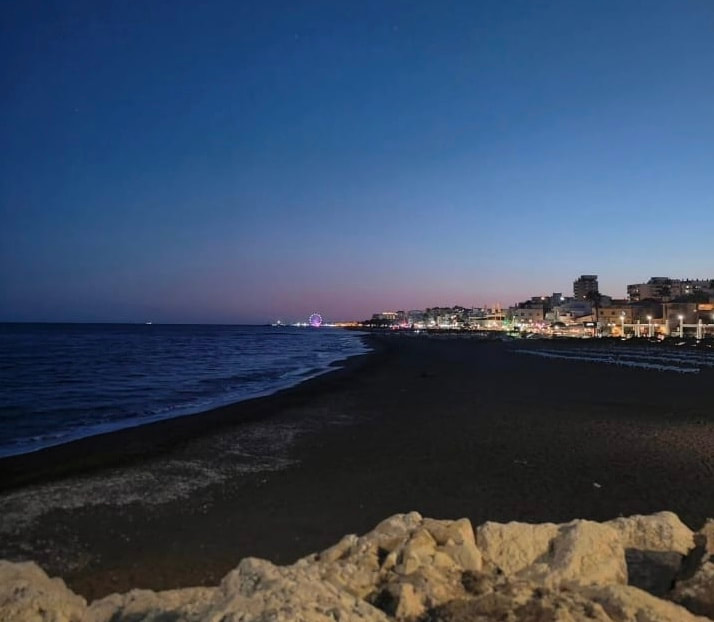
This is one of my favourite landscapes I have taken, I took it on my trip in Malaga I think it is perfect because the sea hits the shore perfectly and you also have the fair illuminating in the background, and the city, it is almost perfectly split down the middle you have the loneliness of the sea and the vibrant city of the night. To improve this image I could have taken it in a more clear place because the rocks almost obstruct the view i think I should have elevated the camera position by just the slightest, but otherwise I think it is a great photo considering I took it at the perfect kind of day at sunset.
The Idea of landscape

|

|
In both of these landscapes there is kind of a western feel to them the artist uses plain backgrounds and rocky surfaces, apart from in the second picture there is the prop of the man on the horse. Both of the landscapes feel pretty distant because they both feel like they are in barren landscapes especially the left one. The way the left one is represented, it is barren and plain, and the emotion is not there it just makes you feel empty, which I thinking the point of the photo, to emptiness. The image on the right is represented as a almost film like image, because it is very hard to get the horse into an image the image has to be taken with a lot of feel, and the clouds in the background look fake, the entire thing looks like a green screen, which I think is a very nice effect that the Artist has captured, it is almost as if it is the same wasteland as the left image. But the image just has more to it.
Centre for British photography trip


When we went to the Centre for British photography exhibition, there were a few exhibitions, two of my favourites were Plastic Soup and Landscape Trauma. I liked Plastic Soup because it is a powerful exhibition which shows us all the Plastic debris left in the ocean the images are made to engage us in the reality of how much we litter, it does this by delivering an aesthetic attraction with the plain black background, which pleases the eye, to a huge dump of litter, which is centred in the middle of the image, because it is meant to be the defining part of the image it really does bring out what exists in the sea, and the fact this is what they have pulled out by hand in the ocean, it delivers a really harsh reality.
Landscape Trauma is a different way of viewing nature, the way humans have impacted it all of the images aren’t taken normally, they are flipped or turned to black and white, the photographer does this to show how we humans have impacted the landscape we have changed it. That is why the photographer edits the image, to show how very few landscapes have been untouched by humans. Which is why the images are edited.
Landscape Trauma is a different way of viewing nature, the way humans have impacted it all of the images aren’t taken normally, they are flipped or turned to black and white, the photographer does this to show how we humans have impacted the landscape we have changed it. That is why the photographer edits the image, to show how very few landscapes have been untouched by humans. Which is why the images are edited.
Back to the future

'Golden Circle' by Dafna Telmore
|

'The Great Wave' by Gustave Le Gray
|
Both of these images are negatives, in both of these images their similarities are the colours they both have dark gloomy colours there are greys and blacks and they fit together perfectly. The main difference between these images though is that one is an actual image designed to fit something we see every so often whilst the other is just a negative with the colours of the left image.
To describe the left image there is a depth to it, the focus is on the wave it is a calming photo.
Whereas on the right image it is like a wasteland, this exactly mirrors the last set of photos one is a landscape taken out of real life, whilst the other is almost a wasteland. I would rather live in the Sea and Sky photograph because it looks a lot more peaceful than Dafna Taylors constructed landscape.
A bit of research

Liz Nielsen - Gardening with You 2020 Photogram
|

Geraldo de Barros - from the series Sobras 1996
|
What I can see in both of these landscape photographs is pictures of nature, and in both the nature is centred, like it's the main part of the image, what is missing from both these images is a background there is no background in either image. What I find the most surprising about these images is the way they have been edited, most likely in an app like photo pea, Liz Nielsen's image is most likely filtered, most likely the cut out filter on photo pea, Geraldo de barrow edited his background and left the tree unedited, which is quite an unusual way to edit a photograph.
When looking at Liz Nielsen's image I feel calm and tranquil almost like I'm gardening, which I think is the purpose of the whole image. When looking at the Geraldo's, image I feel quite overwhelmed, I think it is just the branches giving that sense of chaos, and the unusual plain black background almost relives the feeling but because the tree is centred the feeling of chaos controls the image, so I prefer Liz Nielsen's image as it is more tranquil and just more easy on the eye then Geraldo's one. To make photos like these I would obviously use nature to my advantage, I would also use photo pea to construct the image, I would;ld use the cut out filter for Liz Nielsen's image and cut the piece of nature out and edit the background for Geraldo's image.
I think each artist has removed parts of the landscape to be unique and add their own twist on landscapes, because there are millions of nature images in the world, but adding their own twist on things set's them apart from other artists.
Hiroshi Sugimoto

|

|
Hiroshi Sugimoto is a Japanese photographer who interestingly blurs his photographs and converts them to black and white, each one of his photographs have a weird effect it is black on both to and bottom and each side gradually exposes into a white in the centre, it looks like you are opening your eyes relieving yourself with a blink or waking up from a deep sleep. Commonly in his images he captures tall buildings, and uses the technique of long exposure to really get that eye opening effect. He also takes images of wax figures too. He took his photographs in the 70's, and I think he took many of them in New York and Tokyo guessing by the architecture.
His camera position is head level in some but for example the one on the left is him on top of another sky scraper, his levels vary depending upon the scenario, the angle of view is usually narrow and tall this is because he takes photos of high rise buildings and pillars. For composition he uses a large 20cm x 25cm camera and a black and white film to make that photo black and white.
The reason he uses black and white is because it exposes tonalities and some graduations that we wouldn't be able to see without the black and white effect it also offers a nice old fashioned effect. The meaning of his photographs are that photography is almost a time machine and it is the one thing that keeps it in place forever, I think he believed photography is powerful because it is something that can never be forgotten, our memories can go but photography is forever. The image has an almost dark solitary effect on me, but it is also the opposite, like someone is always there, because there is always another tower, of pillar or wax figure, I think Sugimoto does this on purpose they are contrastingly different, but it works.


From these photos I took inspired by Hiroshi Sugimoto, I think i did well with the tall building scenario even though I had every little to work with, but my issue is the exposure on some images are way to high, this is what I think I will improve when I take more inspired images this week. I also need to blur some of the images more, some are blurred some aren't, to improve I think I will be going to a more high rise area like central London, in these images that I took I tried to recreate the two building in Hiroshi Sugimoto's image with the two cranes in the construction site. I need to edit these photos lessen the amount of exposure on a few, and go to a better area and come back with even better photos next week.
Homework and response to Hiroshi Sugimoto - Refined


For this homework I tried to choose solidarity as the main theme I took photos of single building instead of double buildings like the photographer does, I learnt this time that instead of having a lot of exposure, I made my images, with less exposure, I made them a very subtle black and white, I took images of pillars in the sky, mainly lampposts solo buildings etc. But I always took my images with no clutter in the background only the sky because I almost flipped Hiroshi Sugimotos idea, when he takes images it is almost cluttered in the background it never is just plain so, I flipped his idea, made my building singles, whilst his buildings that he takes images off double, he has a noisy background whilst I made my one clean, I kept the theme of black and white, and of tall pillars because of course my work is inspired by him but I did flip a few of his themes to try and make my work original.
I also experimented with a cool blue colour instead of black and white, I don't think they came off as well as I thought they would but I think I will take some more with better photographs.
I also experimented with a cool blue colour instead of black and white, I don't think they came off as well as I thought they would but I think I will take some more with better photographs.
Dafna Talmor
|
|
Dafna Talmor wants to create utopian landscape, a perfect landscape, she does this by specifically using coloured film to colour her image in her ideal way and she draws lines, cuts out parts of the landscape and combines it with other landscapes, to create a utopian one, she cuts out parts of landscape because it gives off an effect that the landscape looks empty but it feels like it is still there because of the outlines and the way the image has been formed. The way she formed her images is very different to how i formed mine, i didn’t think of creating a utopian landscape, i thought of almost a sense of isolation, my images are
|
Compared to Dafna Talmore who was inspired by the utopian side of constructed landscapes, i went for a sense of isolation, as you can see in my images, i usually take photos of skylines, or buildings and i use the coloured film to cover everything else except the one building or skyscraper in the middle, i also had an idea of flipping this effect, using coloured film for just the one building in the middle. In review of my images i will continue to use the coloured film as it suits my images, although i will stop scratching my images as i don't think it works as well. To refine i will cut out different landscapes and stick them to altogether.
Dionne Lee video
In this video Dionne Lee produced a time lapse of her constructing landscapes, how she constructs them is she prints a double sided foundation image which she sometimes folds over to reveal another landscape, she then puts images under that and rips the page revealing a new image, she does this multiple times, and she sometimes places the ripped page on top of a new constructed landscape. To produce a new constructed landscape she then adds all the broken images on top of one another creating a cluster of landscape.
Dionne Lee Response
Thrice Upon Time - Odette England


Odette England is the professional photographer who took these landscape photographs, she named it Thrice Upon Time, and the photos represent a damaged home, which is why she represents the photos as fragile, by doing a damaged negative, her photographs are taken at eye level, maybe it is because we can see her point of view, in the images the colour is fading, maybe this is to show how her memories of her past faded, maybe her images are to reach out to people who have broken homes, or faded memories. Her images show how fragile childhood is and how fragile the parent/child relationship truly is the circumstances could not have been taken during her childhood because of things like trauma, Odette England portrays not only her own childhood but other peoples, she has constructed a landscape by doing a damaged negative, she takes the landscapes originally of her childhood home, and then damages them, almost making it look liked smashed glass, scratches of black along the photograph, all of this builds to that fragile feeling that the image gives off.
Analysing a photo

This is my favourite photo from Oddete Englands Thrice upon time collection, because she positions the camera face on at the house, which gives it really nice symmetry unlike the other one she took of this house she frame sit better than some of her other photographs. Also she went big on damaging the photograph, unlike her other photos, which just have little black dots, scattered over the image, this one has a crack going right through the centre of the image which I think gives it more depth. Another thing I like about not just this Odette England photograph but every one of her photographs from this collection is that it is taken from her point of view, her eye level. The photo is a damaged negative, which is what I'm going to try and achieve in my final experiment but with a twist.
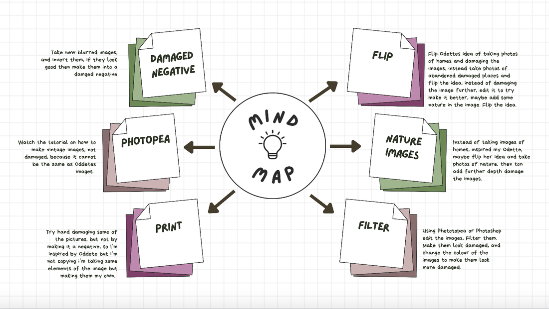
Mind Mapping
Odette England response


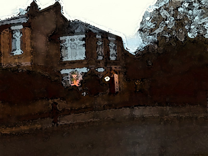
For my images, i took inspiration from Odette England's Thrice upon a time, although i put my own twist on it, i blurred every single photograph, to put my own twist on it, and i also edited them to give this warm effect on the images, from consideration i think i made a mistake in some of the photographs, some of the images i took shouldn't have been blurred and others shouldn't have been given the warm filter, although what i think i did do well is the images at twilight light, just after sunset, where i can get this nice turquoise sky. My other twist was attempting to add nature into the photograph just to give it more depth, as you can see i took the images with nature in front and the home in the background. What i did keep from Odette's images was that feeling of Home i took the images around the area which i live in, and i kept that warm feeling of the photograph.
In reflection i think i could refine the images, by taking them at that golden time just after the sun has set before dar, to really get that vibrant colour, and i think i could improve in the quality of the images, maybe by getting a stand making sure it is eye level, and the images are even, and just improving the quality because some images are weaker than others, i need to have consistency with my images and make them all as good as one another.
In reflection i think i could refine the images, by taking them at that golden time just after the sun has set before dar, to really get that vibrant colour, and i think i could improve in the quality of the images, maybe by getting a stand making sure it is eye level, and the images are even, and just improving the quality because some images are weaker than others, i need to have consistency with my images and make them all as good as one another.
First Experiment


For my first experiment I was inspired by Odette England, although I didn't do a damaged negative, I edited the images in photo pea, and I added the watercolour filter on them, and I edited the brightness, the two images in the middle and on the right, I blurted whilst the one on the left isn't blurred, and I prefer the ones on the right, so I'm going to continue to blur the images. I also think that turning the brightness up on the images, improves them for one, and gives them that Odette England style, it adds some texture to the image it makes it more appealing the eye so overall I have learned from my first experiment, to keep my twist of blurring the images and, to increase the brightness levels of the images on photo pea or photoshop.
The Process of my First Experiment


For my first experiment I edited my images, to try and make them look as similar as possible to a damaged negative, I reviewed and refined many times, for example I didn't like my finished product as seen below, so I edited it, until it had a lot more brightness, and dark patches. So it would look better. I mainly used the watercolour filter, and I edited the dark intensity ad the light intensity and the stroke length until I was satisfied, I tried to make it have a good ratio between light and damage, which is similar to Oddete Englands images, but some still have the blur, which in my opinion makes the image better and it makes the image have a lot more depth.
Before editing
|

After editing
|
You can see how the two compare after I have refined, the new product not only looks more damaged but it it is brighter and more attractive to the eye, you can see if I was to compare the two images to Odette England, you can tell which one has been inspired, and not just put in a filter.
Experiment 2


For the images I mainly went for the warm filter feel, this is because I have attempted to flip Odettes idea of a broken home, for example I experimented by making some images, warm and cozy by putting a warm filter on them and by taking images in the sunlight, or by making sure nature is in the images. I experimented with others I made them cold and damp, by using a cooling filter or by making some black and white.
Experiment 2 Refined
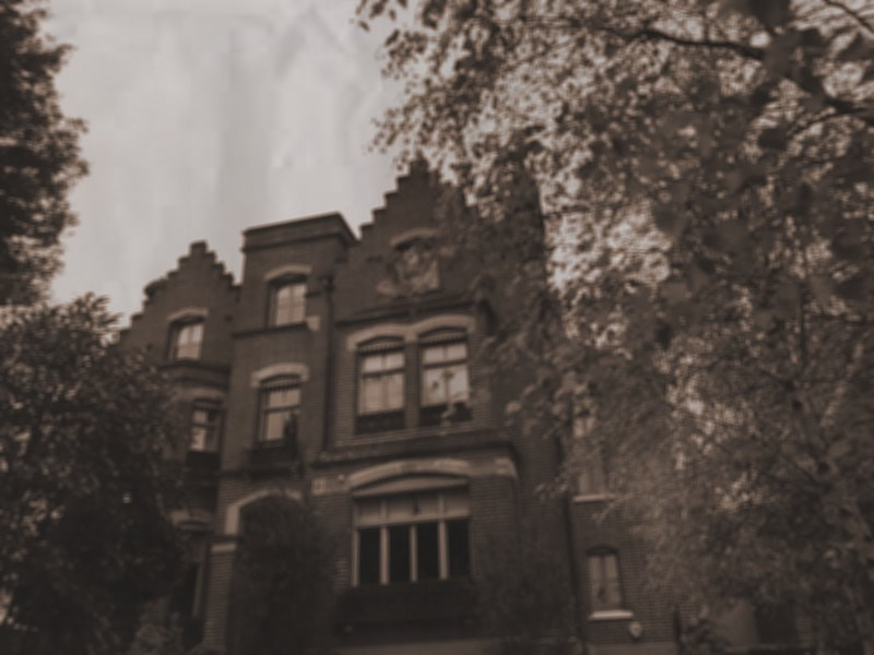


This was my attempt where I tried to make my images have a vintage, damaged feel to them, and I did this without making a damaged negative through photo pea, by adding a texture pack which resembles, creased paper, I also edited the saturation and the brightness and contrast. To make the images look old looking, I have still taken the idea of Odette England's damaged home but I have changed it by making it vintage, and by making it damaged.


The process for how I edited my images, is complicated I started by uploading an image to photo pea, I then attempted to give it an old vintage kind of look, first by changing the saturation, I also turned colourise on which changes the colour of the image, I then changed the brightness and contrast of the image and gave the image a tiny amount of box blur, just to get that old damaged look. I then went onto google and got an image of a creased piece of paper, I then put it on the image and resized it to the correct size. Then I clicked multiply, and the texture pack and my edited image combined, which resulted in a vintage image. I then saved the image. And repeated this process until I got all of my images to have that ancient vintage feel. I edited the settings slightly for some of the images to try and improve them, but I'm happy with the end product.
Final product


|


|


For my Final piece of constructed landscapes, I used Photopea to combine some of my images, with a sunset, to achieve a constructed landscape, I then printed them out. Then made them asotape, after that I used multiple filter paper colours, and destroyed the image using a compass then I put them onto slides and projected them.
